Wednesday, February 23, 2011

Abstraction

Abstraction Blog Post -- Assignment 3


Painted Window -- Anastassias 'Tassos' Pasalis
http://www.tassospasalis.com/site/bw1.html
The main reason I like this photo is because of the strong lights and darks in it. The strongest darks are off center in the lower left hand corner of the photo, almost bursting into everything else. All of the darkest areas also have an outline of strong white. This adds even more to this very contrasted photograph.


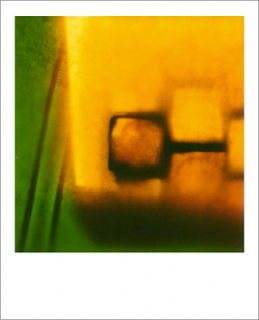
Series 1 -- Xavier Damon
http://xavierdamon.com
This is from a series of photos taken by Xavier Damon. This photo really caught my eye when going through his whole series. The subtle fade of the saturated yellow into saturated green makes the transition a lot less dramatic and is easy on the eye. The strong contrast of light to dark also adds to this photo, your eye is immediately drawn to the dark square just below center. If this were not in color I don't think it would be as good of a composition, if it were in B&W it wouldn't keep the intensity the color achieves.


Jan Staller -- Steel Girders New York 2001
http://www.janstaller.net/photo/earlier-images/
This photo just says "pop" to me. The red girders couldn't be emphasized more in this photo. Repetition of lines is a strong factor in this. What I like the most about this composition would have to be all of the shapes and angles created by the girders. Each shape is unique within the confines of the edges of this picture. The subtle smears of red on the walls; possibly chalk or worn down paint brings your eye to the background and adds to the overall mood.

Wednesday, February 16, 2011

Point of View

Point of View Blog Post -- Assignment 2


escape! -- Mae Quach
This image, although not shot by a professional photographer, shows excellent composition and understanding of the photographic process. The dynamic angles of the buildings trick the viewer into thinking that the point of view is more drastic than it actually is. The fire escape is placed at a great angle and overall just completes the photograph.


How far to the next stop? -- Gustavo Boyzo
This image is more of a panoramic approach which adds to the viewers interest in the photograph. The point of view is over shot but the overall goal of the image is clear, it's a great angle to view a road. The leading lines take your eye right to the background while keeping the foreground just as important.


Shadow pattern -- Markus Moning
This image is very similar to the road shot above, however it is more muted and shows a more complex background. The subject is clearly placed just off center yet the distance from the camera distracts the viewer. It is a great image with the almost vignette adding to the point of view it is shot.

Friday, February 11, 2011

Light and Shadow

Light and Shadow Blog Post -- Assignment 1

When asked to do research for three (3) photographs that I found interesting that have to do with Light and Shadow I knew exactly the ones I wanted. The following images were chosen based on their visual appeal and content.

Madonna -- Henry Meatyard
This image has always been one of my favorite photographs. Henry Meatyard's Madonna is beautifully composed to have the subject the slightest bit off center. The juxtaposition of older women to younger girl adds a deeper connection with the audience. The silhouetted subjects are greatly contrasted by the window blinds, especially the broken ones in the top half of the image.


Moonrise, Hernandez, New Mexico, 1941 -- Ansel Adams
Ansel Adams was a master at photography and his images will for always be visually appealing and techniquly beautiful. The lower half of Moonrise, Hernandez, New Mexico, 1941 is greatly contrasted by the upper half of the photograph. The moon is lightly off center which allows for visual stability and a connection with the lighted graveyard in the lower half. This image uses depth of field to it's advantage and only lights the subject matter important to the photograph.
 
 
Fatima, Portugal, 1964 -- George Krause
 The third image chosen is George Krause's Fatima, Portugal, 1964. This image is balanced by 3 figured and their cast shadows. The obscurity of the meaning adds to my interest in the photograph. The contrast of the gray tones (in what looks to be sand) with the figures almost fully silhouetted bodies is a great addition to the already complete composition.