Friday, February 24, 2012

Chrissie White
http://blacren.com/2009/03/flickr-find-chrissie-white-photography/
This image is very intriguing to me. It creates a lot of unanswered questions. I want to know wethere this is digitally edited of a snap shot of a girl jumping over the bed and catching it just at the right time. The lighting seems to be acceptable by my eyes standard which is why I am split between a straight shot or photoshop. None the less it is very well executed with an interesting cool and muted color palette while still capturing an interesting photograph. I am now sort of interested in catching uncommon situations or surrealistic images after seeing this. It is making me think and i appreciate that in an image.

Chrissie White
http://chrissiewhite.blogspot.com/
I chose this image for several reasons. One of the main reasons is the recent occurrence of nice weather in this fine state of Delaware. The weather reminds of the beginning of spring, where there are still leaves on the ground and yet the trees and environment is starting to bloom. There is a great sense of atmosphere in this photograph as well. The way the light is seen in a beam coming through the trees and softly landing on the ground to create these highlighted emphasized shapes on the forrest floor. With out the clouds of fog in this image it would not be as successful, it would not be as interesting. It would be more mundane and less surreal/dreamy.

Edax Omni
http://www.flickr.com/photos/edax/85027932/lightbox/
I think this is just a beauitful image that is compositionally sound. Another reason I appreciate it is Omni's sense of lighting, the skin on the figure is so soft and smooth it almost resembles a statue. Omni also creates a sense of mystery by not showing the eyes of the subject,  now it is also very possible that isn't real and its a mannequin. just because of hoe the lips seem so close to skin tone and that that skin tone is almost to fair to be human. But either way this is a great photograph with great framing especially with a close-up such as this. The rim light on the hoodie also seals the deal to complete the swooping line created across the image due to the negative space. 

Bill Owens
http://www.flickr.com/photos/wrong/92401003/
This image is a lot different than most in this series. The series being Suburbia. I say this because there are no figures in this image. And it feels a lot less home"y" than the other images because of the lack of materials and the open space. Now that is not to say that someone couldn't consider this their home but it does lack a sense of love and completion that most homes. 

Bill Owens
file://localhost/Users/McLaughlinC/Desktop/image-by-bill-owens.jpeg
"We're really happy. Our kids are
healthy, we eat good food, and we
have a really nice home."
Owens incorporates quotes from his models. By doing so he creates a sort of time stamp, much like the cars in Stephen Shore's photographs. What may seem to the norm at the time can now have an almost comedic quality. Solely for the fact that it is a new era with new beliefs. This is a very interesting photograph especially with the quote added in his series Suburbia his sense of organizing shapes within the frame is well thought out and executed. The confrontation of the two adults and even the baby seals the deal to this "perfect" family portrayed by owens and his camera.


Bill Owens
file://localhost/Users/McLaughlinC/Desktop/image-by-bill-owens.jpeg
We really enjoy getting together with
our friends to drink and dance. It's a wild
party and we're having a great time.
Another picture by Owens' series Suburbia with another odd quote. It almost seems as if the quote is from a T.V. series of the "perfect couple" in your average America. It almost seems fake, or as a front by these people. Or maybe they are jus naive? They aren't putting on a front for the camera, maybe it is just the juxtaposition of the quote of a wild party and this portrait of a couple portraying a sense of calm. far from wild. Yes, the juxtaposition is what gives this series a curve from the norm. I think it works, very well actually, and proves the point on how titles or captions included with photograph's can make them more interesting.

Friday, February 10, 2012

Week 4

Len Jenshel
http://holykaw.alltop.com/allphotopic-mount-st-helens-30-years-later
This photograph is very monumental. A different perspective on a landscape with a lot of texture. This image almost seems black and white. The drift wood leads your eye to the horizon line as well as back to the mountains. Another reason I like this image is because it was shot for national geographic.  There is also a great depth in this image and use of dark tones.

Len Jenshel
http://gallery.pictopia.com/natgeo/photo/9448953/
This is a very amazing photograph. The way that Jenshel captured the fireworks as well as evening out the light on the fence. I also think this is a great example of mixed light as well.  The compliments of red and green as well as the tungsten light on the fence. The fence also creates a line for your eye to travel stopping at the couple gazing in the distance and then looking up towards the fireworks.

William Eggleston
http://artblart.wordpress.com/2010/05/18/exhibition-william-eggleston-democratic-camera-photographs-and-video-1961-2008-at-the-art-institute-of-chicago/
I think this is a great use of fluorescent lighting. The composition is spot on as well. The way that Eggleston arranged the objects within the frame. This photograph has a very cold. "prim" if you will environment. The subtle creases in the chair that relate to the creases in the bed.

Thursday, February 2, 2012

Stephen Shore Week 2

Stephen Shore
http://champagneandheels.com/art/stephen-shore-in-aspen/
I believe this is a very successful photograph that also screams SHORE! I say this because he has a very distinct range of tones and hues, possibly due to the film but at any rate very distinct. Something i find very intriguing is the fact that there are very minimal objects in this picture and yet it is composed to its full potential. It is a very good example of how you do not need a very cluttered frame to produce something interesting. I also appreciate the relationship of the gap between the truck and the white pole, as well as the two poles to the sign.

Stephen Shore
http://jmcolberg.com/weblog/extended/archives/a_conversation_with_stephen_shore/
This is one of my favorite Shore photographs. Reason being, it has a great sense of a hotel or guest room. I would assume hotel just because of the mount for the T.V. and the glass over the desk. It is amazing to me that Shore has captured such a photograph with the tonal range of the room being spot on and the window blown out just enough. You cannot see outside and it is just barely extruding onto the trim of the window. The addition of the feet with the shoes on the bed also relates to the idea of a hotel; someone there but ready to leave at any moment, with the suitcase unlatched but not open. 

Stephen Shore
http://modernartobsession.blogs.com/modern_art_obsession/2005/12/stephen_shore_a.html 
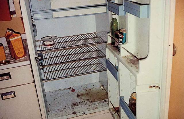
This I would have to say does not seem like a very interesting image. Yes, the colors could be interesting in the sense that he utilizes the main colors on the color wheel but other than that it appears to me as a snap shot. Or in better words a documentation. It almost reminds me of a picture that a college student would take to show there fridge after they realized you're not supposed to unplug it and keep the doors closed over winter-break. So maybe it is more the idea behind the photograph than the actual photograph that bothers me. Although it still does not show the essence I can see in most other photographs that Shore has produced. 

Friday, January 20, 2012

Week 1 Color Photo

Richard Misrach
http://artjetset.com/2010/01/15/richard-misrach-at-pacewildenstein-2/
I was intrigued by this image due to the fact that I have never seen something like it before. When I first saw it seemed as if there were huge salt deposits in the dessert crystallizing to from these structures. But as  I read into it it is actually Misrach's style of using a digital negative or at least parts to create such an image. It made me ask several questions as well as jogged my mind which makes this photograph very successful in my opinion.

Tim Davis
http://nicolettalollibestphotographers.wordpress.com/2010/06/17/©-tim-davis/
I thought this photograph was quite interesting and it also fit in with the assignment this week. The very neutral hues surrounding this pinnacle of color. Another thing that adds to this photograph is the warped form of a very recognizable subject matter; McDonalds. Davis may have a deeper meaning behind this photo as well, our societies engrossing taste for this fast food and the effects it has on ourselves as well as our community. This overly projected business that is contained by a decaying or not as well maintained house. The composition is also very strong letting the eye immediately go to the color and shift around the subtle hues around it.

Len Jenshel
http://photography.nationalgeographic.com/photography/enlarge/staircase-escalante-building_pod_image.html
This photograph is also very amazing. It makes me want to be there, to touch the building and experience all this environment has to offer. Maybe its because 1. I love National Geographic or 2. I love the outdoors and can't wait to travel. But at any rate the way that Jenshel makes the building pop from a very similar hue'd background is excellent. He also has a a great contrast of blacks as well as white tones. The color in this the texture is also very intriguing to me, and its very surprising that it wasn't picked for the assignment he shot for.

Tuesday, December 13, 2011

Week 14

WeeGee
http://www.americansuburbx.com/2011/11/weegee-mass-hysteria-1998.html
This image stood out to me because it made me ask many questions. Why are these kids here? Where is "here"? How did he get the vantage point he has? Did he use a flash? Either way this is a very interesting photograph. WeeGee shows a great sense of depth by having the object in the foreground blurry and very close to the camera while the children are laying on the floor several feet below. There is a lot of action going on in this photograph which is hard to accomplish without the use of movement. The boy on the left is looking across to what I would assume is another child while the kids are laying on the floor half asleep and very crammed.

Horoshi Sugimoto
http://www.pdnphotooftheday.com/2009/09/2060
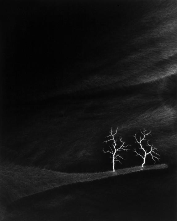
Hiroshi Sugimoto is part genius. Yes genius. I say this because this photograph is a mixture of things, very amazing feat's in the form of photography. Atleast I think so. He has here what seems to be an animal skin appearing as both the sky and the ground of this photograph. While doing so he has electrical charges sprouting much like a tree without leaves on a winter day. The background is also very dark but seems to portray a great sense of depth within the photograph. The trees are emphasized due to the large contrast between pure white and almost pure black.

Bruce Davidson
http://standardmint.com/?p=1144
What caught my eye with this photograph was the juxtaposition of the children playing in this body of water. They are all hanging from branches almost all the way out of the water. This is not something I as a viewer would recognize as children playing in a body of water just because I would start to assume the children would be in the water or splashing around. This photograph seems more posed or as if they were scared to go in the water. Their dark bodys and loss of information of the body seems to further the notion of fear almost in this photograph. Contrasting the common idea of children playing in a body of water for fun on a hot summer day.

Monday, December 5, 2011

Week 11, 12 and 13 Blog

Jacob Riis
http://famousartistsbirthdays2.blogspot.com/2011/05/jacob-riis.html
This photograph shouted RULE OF THIRDS to me right away, although the mid-point of the boys is almost centered. The composition is also very triangular like many paintings you would find in the 1900's.  The lines on the wall also mimic the lines from the steps with subtle variations within each form. I am not sure whether or not this photograph is staged but I have a feeling it isn't. They actually look like they are sleeping or at least resting.

Karl Blosfeldt
http://karlblossfeldtphotos.com/photos_details.asp?id=14&Photo_ID=120
When I was scrolling through the images of Blosfeldt I started to notice that the organic plants that he was photographing often had a relation with other objects. This imparticular reminded me of skyscrapers in New York. The Empire State Building to be exact. Due to the several "levels" if you will and the point at the top. Each photograph another side of the building. I find this quite interesting and I may try something of this nature for myself in the future.

Nicholas Nixon
http://froglyspeaking.blogspot.com/2010/11/picture-is-worth-thousand-words.html
This picture says a lot to me. It shows the durability and frailty of the human body at the same time. It shows the age of the elderly person which means that he/she has been here for quite a few years, enough to go there and back. While this person has been through a lot already they are facing their hardest experience now. The hand almost looks as if there is no muscle, as if they wouldn't be able to move it if they tried. The sweater is also falling off of the table as if there isn't even an arm in the sleeve. This picture tells me struggle, pain and near death. It is an overall powerful image and very well executed.

Richard Misrach
http://www.utata.org/salon/20487.php
I think this photograph is beautiful. The subtleties are what make it. The faint horizon line, the faint telephone wire, the gradients within the water and sky along with the slightly out of focus reflections really make this image work. It is completely balanced although at first glance it may seem like a grouping of random objects. Another thing that makes this photograph so interesting to me would be how this situation is most likely not a good one. This picture is of a flooded street or field. Something no one wants, excess water means destruction in most cases. Yet Misrach creates a beautiful composition and moment in time.

Bruce Davidson
http://graememitchell.com/blog/bruce-davidson
Bruce has a great deal of things working for him in this photograph. For starters we have the use of a wide angle lens to give the viewer a feeling of distance from the shadowy figure within the frame. The fact that he chose to get closer to the wall also contributes to the depth of the room. Again we have a great use of rim light on the figure as well as the ominous posture. The figure has his hands behind his back which makes the viewer wonder whether or not he has something in his hands that he is hiding or if he is just standing with good posture. The curtain over the window also gives a nice diffused light within the room.

Carleton Watkins
http://emmewest.hubpages.com/hub/Carleton-Watkins-Documentary-Photographer
I realize this is not the most interesting of photographs but what I found most engaging was the odd resemblance of a high heeled shoe from far away. Yes, this may be a stretch but if you get farther away from the image and even squint a little the highlights in the photograph make-up the silhouette of a high heeled shoe. The water fall would be where your foot would go in and the decaying tree trunk would be the heel. Other than that I am not the most intrigued by this photograph. Which is ok because Watkins mainly did documentary photography.

August Sander
http://oriannalavie.wordpress.com/2011/03/05/photographer-of-the-month-august-sander/
This photograph appears to be a bit surreal to me. I am not sure whether it is the tonal range or the thing itself (the bridge). I suppose it is a combination of both. I find it very interesting that Sander's could get those blacks under the bridge while the field on the right hand side has a haze over it and is not very contrasted. A very well executed depiction of atmospheric perspective. Along with a surrealistic quality that is not easily obtained by a straight photograph.

Andreas Gursky
http://mastergram.tumblr.com/post/9577305804/andreas-gursky-bahrain-1-2005-modified-using
I appreciate this photograph in many ways. The first being the flowing earthy feeling it emits even though it is a composite of roads. This contrasting perspective allows me as the viewer to start thinking outside of the box. Gursky has a great way of creating something out of nothing. Merging and deleting parts of images to create a design friendly photograph. At first glance I would assume this was an image of oil on a surface of some kind but with further examination I realized it is nothing of that sort. This is part of the  of Gursky. His ability to make the roads seamlessly intertwine to make a whole.

Mark Klett
http://crashinglybeautiful.tumblr.com/post/1121346619/mark-klett-from-strange-eyes
Design is a huge factor to why I appreciate this photograph. Klett uses the huge rock faces to create a wonderful composition. The figure within the sliver of light only adds to the composition as well as the mountain of rock in the distance. It is a very distinct photograph which is what I aim for as a photographer. It also reminds me of DCAD's two dimensional design class. By using negative space as well as unity and variety Klett creates a very interesting image. The rock mountain in the background also mimics the bottom portion of the grouped rocks in the foreground. Without the view point of Klett this image would not be where it is compositionally. The use of light is spot on and very interesting.