Tuesday, December 13, 2011

Week 14

WeeGee
http://www.americansuburbx.com/2011/11/weegee-mass-hysteria-1998.html
This image stood out to me because it made me ask many questions. Why are these kids here? Where is "here"? How did he get the vantage point he has? Did he use a flash? Either way this is a very interesting photograph. WeeGee shows a great sense of depth by having the object in the foreground blurry and very close to the camera while the children are laying on the floor several feet below. There is a lot of action going on in this photograph which is hard to accomplish without the use of movement. The boy on the left is looking across to what I would assume is another child while the kids are laying on the floor half asleep and very crammed.

Horoshi Sugimoto
http://www.pdnphotooftheday.com/2009/09/2060
Hiroshi Sugimoto is part genius. Yes genius. I say this because this photograph is a mixture of things, very amazing feat's in the form of photography. Atleast I think so. He has here what seems to be an animal skin appearing as both the sky and the ground of this photograph. While doing so he has electrical charges sprouting much like a tree without leaves on a winter day. The background is also very dark but seems to portray a great sense of depth within the photograph. The trees are emphasized due to the large contrast between pure white and almost pure black.

Bruce Davidson
http://standardmint.com/?p=1144
What caught my eye with this photograph was the juxtaposition of the children playing in this body of water. They are all hanging from branches almost all the way out of the water. This is not something I as a viewer would recognize as children playing in a body of water just because I would start to assume the children would be in the water or splashing around. This photograph seems more posed or as if they were scared to go in the water. Their dark bodys and loss of information of the body seems to further the notion of fear almost in this photograph. Contrasting the common idea of children playing in a body of water for fun on a hot summer day.

Monday, December 5, 2011

Week 11, 12 and 13 Blog

Jacob Riis
http://famousartistsbirthdays2.blogspot.com/2011/05/jacob-riis.html
This photograph shouted RULE OF THIRDS to me right away, although the mid-point of the boys is almost centered. The composition is also very triangular like many paintings you would find in the 1900's.  The lines on the wall also mimic the lines from the steps with subtle variations within each form. I am not sure whether or not this photograph is staged but I have a feeling it isn't. They actually look like they are sleeping or at least resting.

Karl Blosfeldt
http://karlblossfeldtphotos.com/photos_details.asp?id=14&Photo_ID=120
When I was scrolling through the images of Blosfeldt I started to notice that the organic plants that he was photographing often had a relation with other objects. This imparticular reminded me of skyscrapers in New York. The Empire State Building to be exact. Due to the several "levels" if you will and the point at the top. Each photograph another side of the building. I find this quite interesting and I may try something of this nature for myself in the future.

Nicholas Nixon
http://froglyspeaking.blogspot.com/2010/11/picture-is-worth-thousand-words.html
This picture says a lot to me. It shows the durability and frailty of the human body at the same time. It shows the age of the elderly person which means that he/she has been here for quite a few years, enough to go there and back. While this person has been through a lot already they are facing their hardest experience now. The hand almost looks as if there is no muscle, as if they wouldn't be able to move it if they tried. The sweater is also falling off of the table as if there isn't even an arm in the sleeve. This picture tells me struggle, pain and near death. It is an overall powerful image and very well executed.

Richard Misrach
http://www.utata.org/salon/20487.php
I think this photograph is beautiful. The subtleties are what make it. The faint horizon line, the faint telephone wire, the gradients within the water and sky along with the slightly out of focus reflections really make this image work. It is completely balanced although at first glance it may seem like a grouping of random objects. Another thing that makes this photograph so interesting to me would be how this situation is most likely not a good one. This picture is of a flooded street or field. Something no one wants, excess water means destruction in most cases. Yet Misrach creates a beautiful composition and moment in time.

Bruce Davidson
http://graememitchell.com/blog/bruce-davidson
Bruce has a great deal of things working for him in this photograph. For starters we have the use of a wide angle lens to give the viewer a feeling of distance from the shadowy figure within the frame. The fact that he chose to get closer to the wall also contributes to the depth of the room. Again we have a great use of rim light on the figure as well as the ominous posture. The figure has his hands behind his back which makes the viewer wonder whether or not he has something in his hands that he is hiding or if he is just standing with good posture. The curtain over the window also gives a nice diffused light within the room.

Carleton Watkins
http://emmewest.hubpages.com/hub/Carleton-Watkins-Documentary-Photographer
I realize this is not the most interesting of photographs but what I found most engaging was the odd resemblance of a high heeled shoe from far away. Yes, this may be a stretch but if you get farther away from the image and even squint a little the highlights in the photograph make-up the silhouette of a high heeled shoe. The water fall would be where your foot would go in and the decaying tree trunk would be the heel. Other than that I am not the most intrigued by this photograph. Which is ok because Watkins mainly did documentary photography.

August Sander
http://oriannalavie.wordpress.com/2011/03/05/photographer-of-the-month-august-sander/
This photograph appears to be a bit surreal to me. I am not sure whether it is the tonal range or the thing itself (the bridge). I suppose it is a combination of both. I find it very interesting that Sander's could get those blacks under the bridge while the field on the right hand side has a haze over it and is not very contrasted. A very well executed depiction of atmospheric perspective. Along with a surrealistic quality that is not easily obtained by a straight photograph.

Andreas Gursky
http://mastergram.tumblr.com/post/9577305804/andreas-gursky-bahrain-1-2005-modified-using
I appreciate this photograph in many ways. The first being the flowing earthy feeling it emits even though it is a composite of roads. This contrasting perspective allows me as the viewer to start thinking outside of the box. Gursky has a great way of creating something out of nothing. Merging and deleting parts of images to create a design friendly photograph. At first glance I would assume this was an image of oil on a surface of some kind but with further examination I realized it is nothing of that sort. This is part of the  of Gursky. His ability to make the roads seamlessly intertwine to make a whole.

Mark Klett
http://crashinglybeautiful.tumblr.com/post/1121346619/mark-klett-from-strange-eyes
Design is a huge factor to why I appreciate this photograph. Klett uses the huge rock faces to create a wonderful composition. The figure within the sliver of light only adds to the composition as well as the mountain of rock in the distance. It is a very distinct photograph which is what I aim for as a photographer. It also reminds me of DCAD's two dimensional design class. By using negative space as well as unity and variety Klett creates a very interesting image. The rock mountain in the background also mimics the bottom portion of the grouped rocks in the foreground. Without the view point of Klett this image would not be where it is compositionally. The use of light is spot on and very interesting.

Tuesday, November 8, 2011

Week 10 Blog

Paul Strand
http://photography-now.net/paul_strand/index.html
This image captured my attention due to the oddity of its composition. While very good it is more unconventional of a composition. The wood of a building or shack is a frame for the snow and trees in the background. I think he may be using a telephoto lens because the trees and house behind them seem to be smashed together and almost a little flat. The texture and tones of the wood grain really makes the trees in the background pop, and even with the intense amount of light outside of the door it is not blown out. A great print and picture.

Edward Weston
http://photography-now.net/edward_weston/index.html
I am intrigued by the thing itself in this photograph. Weston has a knack for making the viewer really examine the subjects of his photographs. By my eye I would assume that these are rocks that have been decaying from water for hundreds of years. The light tones within the indented rock is very interesting because usually I relate these spaces with dark tones. The lines in this image guide ones eye around the photograph weaving between texture and tones. He also has captured some really great textures as well.

Walker Evans
http://photography-now.net/walker_evans/
The first thing I noticed about this photograph is the repetitive textures against the more subtle background of clouds. Evans still gets a lot of information out of the clouds while getting everything he could want out of the pallets and wooden boxes below. This leads me to believe he burned the sky in or else it may have been blown out. The smoke stacks further the depth of the picture while adding a bit of variety. Still vertical repetitive lines but also diagonal lines cutting through the clouds. Also the subtle reflections in the puddles in the foreground really add a nice touch that may not be noticed from the viewer right away.

Tuesday, November 1, 2011

Week 9 Blog

Eliot Porter
http://photography-now.net/eliot_porter/portfolio1.html
Porters work reminds me a lot of the thing itself. He creates different variations of what he finds aesthetically pleasing. What he changes about this landscape is the point of view in which he chose to shoot. The added reflection of the water lets the viewer see more of the rock face also in a different light than the direct image. He uses a warm saturated color palette with darker tones in the background. I have been very interested in reflections lately and I think Porter created a successful photograph of a reflection.

Rolfe Horn
http://photography-now.net/rolfe_horn/index.html
Horn's work reminds me of Tokihiro Sato's work. I chose this photograph for that reason and because Horn is using a neutral density filter to obtain this quality in the image. The long exposure makes the water appear as fog because it takes the white caps of the water when the image is exposed due to how bright it is. I will say that Horn has more of a fog effect then Sato's long exposure water pictures. Horn also gets tones from both the water and the sky, the sky is but ten percent darker than the water or "fog." And the emphasis is placed well on the darker group of rocks further back in space.

George Tice
http://photography-now.net/george_tice/index.html
I respect this photograph because Tice goes against the rule of thirds and takes the photograph straight on but still creates asymmetry with the figure in the background. Although he is in a dark space he gets information in the much brighter direct sunlight beyond the bridge/platform. A subtle cityscape framed within the confines of a very design heavy frame. I also chose this picture because it reminds me of a bridge that i shot at this week for Photo II , the long arches on each side of the boards that show structure in the image.

Friday, October 21, 2011

Week 8 Blog

Brassai
http://transversealchemy-raw.blogspot.com/2011/01/brassais-paris-late-night-ramblings.html?zx=fcbbf7177d40ed20
This photo has a great sense of mystery to it due to the unclear depictions of objects from the fog. We know there there is a car stationary on the road shining its light at something possibly out of the frame. The viewer also cannot tell if there is anyone actually in the car. The atmospheric perspective is also magnified by the fog. The silhouetted trees have great definition even though the fog is there adding a more graphic aspect to the photograph.

Joel Meyerowitz
http://www.theoriginators.com/joel-meyerowitz-photography/
This photograph is absolutely amazing and I'll tell you why. One, he captures a firework not only exploding but on its way up to create a "light star" in the sky. Two, he has an amazing tonal range in the middle of the night. Three, the detail he achieved really makes this photo. Okay so enough with the numbers, Joel makes something mundane into something beautiful. The texture of the snow on the car, the tire tracks from a car that was beside it and the tree in the foreground that still has definition while backed up to the row of trees in the background. I think the most amazing aspect of this photograph to me would have to be that is was taken at night and he accomplished a full tonal and detailed photograph.

Fazal Sheikh
http://photography-now.net/fazal_sheikh/index.html
This image really makes me want to go out and take some portrait photographs. Its very dark and yet there are still some very bright whites, and the gaze that the figure has is very engaging even though he is not directly looking at the viewer you can sense he is in deep thought. It is very rare that I want to go out and take some portraits but the lighting in this image is just so concrete. I also want to get into the studio and really start learning the numerous possibilities of lighting.

Tuesday, October 18, 2011

Week 7 Blog

7Paul Strand
http://www.metmuseum.org/toah/works-of-art/1987.1100.10
This photograph screams design to me. The repetition of lines with the break of the table against the wall or ground adds a bit of variety. Throwing off the lines and causing them all not to show as well as creating another direction for your eye to follow. The minimal color palette ranging from an off-white-yellow to a dark brown/black is easy on the eyes to allow them to flow up down and around the image. Although this image is very asymmetrical the darks and lights even the weight making it very acceptable to my eye.

Imogen Cunningham
http://www.artnet.com/Galleries/Artwork_Detail.asp?G=&gid=423969340&which=&ViewArtistBy=&aid=4668&wid=424893232&source=artist&rta=http://www.artnet.com
This to me is a very powerful photograph. The emotion captured, which may not be easily seen at first, is almost startling. This man in this setting tells me a story. A story that he once was here chopping this wood, using that sledge hammer and working hard. Now that he has reached 90 (My father at 90 is the title) or an older age in general shows that he cannot do those tasks he once could. He put on his suit and he walks with his cane in a place he is very familiar with. Not as familiar as it used to be but very familiar. He almost has a face of confusion which just makes me further believe he does not know this world as well as he used to. Yes it is a pretty straight on photograph but there are so many subtle details that give such a story and I appreciate that a lot in a photograph.

Dean Chamberlain
http://jasonmelcher.com/LIGHT_GRAFFITI_WEBSITE/Dean_Chamberlain_FS/index.html
I am incorporating "Light Writing" into my book for this first semester of Photo II so I have been looking  up quite a few artist who incorporate it into their work as well. Shelly was so nice as to give me a flyer from a show around Philly so I hopped on there website and found quite a few people. This man stood out to me because what he does is much different than your conventional "Light Writing" rather than adding the light in as its own subject he exposes different areas to give it unconventional tones that seem to be photoshopped in. In his other work it is more prominent but i chose this one because it is a mix of both. The eye of the viewer is brought to the center of the photograph and then dispersed every which way because of the outburst of light he has created. He also gets the blue of the sky in there, most likely from the long exposures he uses.

Monday, October 10, 2011

Week 6 Blog

Michael Bosanko
http://www.michaelbosanko.com/photo6402250.html
Michael Bosanko is a magician with lights. He finds interesting compositions and adds a huge presence of light to the situation. Even if the composition seems mundane or uninteresting it certainly is not after he adds in a bit of light. The light in his photographs creates a world I would like to tap into. It has this undeniable presence. In the shot above he creates a sea of green while accenting the lines of the fence with what may be sparklers. Adding another wavelength of purple above the sea just bringing your eye further and further into the image.

Mark Klett and Byron Wolfe, 2008. At the Canyon's edge: from the foot of the Toroweap to the "Devil's Anvil" overhang with an upstream view of the Colorado River. Inset L to R: William Bell, 1872. (Courtesy National Archives) 
http://www.klettandwolfe.com/
Mark Klett has a great idea going here. Its amazing how time can change so many things and yet when it comes to these canyons they are almost exactly the same from the late 1800's up until a few years ago. It lets us know as photographers we are truly capturing reality it is all up to the vantage point, the execution and our ideas that set us apart from each other. A picture one has taken could possibly be shot again. Of course it is a lot more accessible with something like this rather then Bosanko whom is shown above. 

Andre Kertesz - Arm With Fan 1937
http://blog.ricecracker.net/tag/andre-kertesz/
Andre Kertesz has created an interesting photograph out of almost nothing. By having this arm (which is from a man fixing the fan on a ladder) Kertesz allows the viewer to collect ideas to why this arm would be coming out of this fan. Does the fan work? Is it gonna turn on on him? This juxtaposition of an arm coming out of a fan just sparks the imagination or at least I know it sparks mine. The mans head is just barely visible towards the top of the fan, the slightest bit of gray makes him noticeable. Adding a subtle element to this "in your face" photograph.

Tuesday, October 4, 2011

Week 5 Blog

Maurizio Polese - Escape
http://www.smashingmagazine.com/2008/06/09/beautiful-black-and-white-photography/
I found this image while looking at another photographer. First recognizing the dark shape one could relate it to a silhouette of a person. Upon further investigation I noticed that the dark shape was actually a shadow and the picture was taken upside down. The juxtaposition of the cobblestone road very well could throw the viewer off. It adds a very nice texture, I accept the fact of the picture being flipped and do not think it would be quite as strong if it were flipped to its original position. The black space in the bottom right of the photograph was also very thought out creating more intensity and tension at the bottom of the photograph.

Stephen Shore - Shoes
http://peoplesforeignexchange.wordpress.com/2010/06/07/stephen-shore-at-the-douglas-hyde-gallery-dublin/stephen-shore_shoes/
I believe this photograph gives us a flash from the past, lounging around watching T.V. The cropping of this square frame was well thought out, the negative space on the right side of the image balances the bright window on the right hand side of the image. The photograph has an old school feel to it in general due to the tube television, suitcase style, pattern on the couch/chair and the iconic "Chuck Taylors" While the image has a very neutral color palette it still catches the eye.

Josef Koudelka
http://www.atgetphotography.com/The-Photographers/Josef-Koudelka.html
I can relate to this image because I understand the difficulty shooting a black dog in the snow. Trying to get tones or facial features is near impossible. What Koudelka shows here is that you can still get an interesting photograph of a black dog in the snow without getting too much detail. The decisive moment creates this dynamic black shape in the foreground of the picture. Breaking up the snow is a rug underneath the dog also allowing another gray tone into the image. With a few trees in the background breaking up the scene and creating a greater sense of space.

Tuesday, September 27, 2011

Week 4 Blog

Josef Sudek - Egg
http://5magazine.wordpress.com/2010/11/06/over-the-photographs-by-josef-sudek/
What may seem as such a simple picture is not. This minimal choice of subject matter has, in my eye, created an excellent photograph. It also demonstrates how something simple such as a plate and an egg can make a photograph. The information given in this image is amazing, the scratches on the sill, suttle reflection in the glass, bright whites and dark blacks. All of this information creates a complete pleasing photograph that has a great tonal range and composition.

Emmet Gowin
http://raphaelgianellimeriano.blogspot.com/2011/04/emmet-gowin-photographs.html
The use of a wide angle lens really captured the emotion in this image. The elongation of the body with the same feeling from the room makes both the figure and environment become one. The two windows also add two highlights that really make the image pop. The horse in the left window also makes the viewer ask questions. Is that a decoration? The kids? So is she in the kids room? Gowin uses the curtains and clothing to relate to each other as well with the shadows and ripples.

Lewis Baltz - Park City
http://www.artnet.com/artwork/426108364/title-park-city-1980-a-sequential-work-with-102-elements-element-no-80.html
Here we have another image with simple subject matter. Although there are not many objects in this photograph there are still some very interesting things going on. For starters even though there are only five surface planes there is still a full tonal range. The black rectangle is almost centered in the photograph but not quite. The small creases between the dry-wall and screws add more of a texture breaking up the light gray space in the background. In the foreground we also have debris which adds even more texture, the debris is not over powering in this photo due to the high contrast in the center and to the right side of the photograph.

Monday, September 19, 2011

Week 3 Blog

Alfred Stieglitz
http://www.metmuseum.org/toah/hd/stgp/hd_stgp.htm
This photograph just reminds me of Batman/Gotham City. Usually I am not fond of a lot of noise in an image but it works for this one. It adds texture and a luminescent feeling around the two lights on the closer building. Stieglitz also captures a high sense of depth of field. I suppose I am getting a "Batman" feeling from the this image because of all of the building tops and mystery it portrays. An overall well composed image with a great tonal range.

Jerry Uelsmann
http://www.tfaoi.com/aa/6aa/6aa342.htm
Jerry Uelsmann is a master of the Darkroom and someone I look up to. His images are one of a kind and are unmistakably his. The way he can make a picture so believable is insane. Not only is the figure in this image accepted by my eye but it captivates it. The light on her body seems to be exactly of that of the background. Not only does he add the figure but he adds the reflection, this is what sells the photograph and makes it so intriguing to me. The reflection is also distorted and blurred to appear as if it was actually there. All in all he has great craftsmanship and an eye/brain for believable unbelievable images.


*dans'
http://www.flickr.com/photos/dans180/178435614/sizes/o/
I picked this last one because lately i have been shooting a lot of long exposure photographs, and seeing this made me ask even more questions on how I can make my long exposure's my own. My assumption would be that he had the long exposure on the buildings/cityscape. After leaving the shutter open a good while I'm thinking the photographer either zoomed in or out to get the streak effect shown. The composition is there, the color is very vivid and creates a focal point and it just stands out from the bunch which seems to be a common trend for me lately. 

Monday, September 12, 2011

Week 2 Blog

Bruce Davidson
http://stu89edwards.blogspot.com/2011/08/bruce-davidson.html
This Picture stood out to me when looking through Davidsons work. The reason being he uses Point Of View, Shadow, Objects and Texture all to his advantage. These four things make this photo an individual. The texture of the brick makes a usually common surface we walk on to something that contrasts the figures walking in the frame. This brings me to the shadows of the figures. Looking back at the "four" things I thought were important there is another the time of which he took this picture, at anytime right after or right before this picture was taken the shadows would not be as involved. Due to the timing he captured most of these figures in mid-step. I am then wondering to myself... what are these objects in the frame? The shadows help give it away but hats and collars seal the deal.

Justine Kerland
http://hautecouturetaxonomy.wordpress.com/2009/04/09/photography-by-justine-kurland/
I kind of stumbled upon this photo. and the thing that attracted me to it was the idea of how real it could be. This photograph has a "shock" factor, if you will. A boy floating in a river pale as can be with no notion of fear. For anyone who has a sibling or child this can be a real big fear. Going out to enjoy the river and then tragedy hits. What happened to johnny??? To me this photograph tells many stories and asks many questions. Where are they? Is he dead? Do they see him? Are they gonna look for help? The list goes on for me. This photograph is also very well composed and has a range of Shadows and Highlights that attract my eye.

Tokihiro Sato
http://www.tonkonow.com/sato.html
Tokihiro is a master of manipulating light to his advantage. As one could see in this photograph portrayed above. He not only brought a new style photography but owned it as his own. In the photo above he uses a long exposure to add fluid lines over and over through out all of the steps on the hill. Tokihiro influenced my work for my assignment this week for class "Fact or Fiction" I introduced light and long exposures into the work I put in this week. I am not sure I will fabricate it quite as well as he does but I will see. I also like the strong lines he has in most of his photographs very geometric with buildings, stairs, walls, walkways, etc. I am attracted to these things myself and it just amplifies my enjoyment from looking at his photographs.

Tuesday, September 6, 2011

Manuel Alvarez Bravo -- Instrumental 
1931, Gelatin silver print, printed on Agfa paper
The reason i picked this picture was because it caught my eye. The strong highlights and shadows along with texture just give the picture a great feel. Along with the design aspect i just think it is a complete idea with great dynamics. Nothing feels out of place. I also can relate to the wear and tear that these tools show because I have used wrench's many times before and i think it captures the durability and strength they have.


George Tice -- Country Road
http://asherneimangallery.com/george-tice/#id=tice&num=1
I find this photograph interesting because I have never seen one like this before. The high contrast of the road and space surrounding it leads your eye right to the car. The road almost looks like a light streak or paintbrush just swept across a black canvas. Although there is a a lot of negative space it doesn't overpower the picture and drown out the car and road. Overall  think it is a great composition and use of light.

Brett Weston -- Dunes
http://www.visiongallery.com/index.php?tPath=1_3_161_230
The reason I am attracted this photo would be the rim highlights on the dunes, they have definite shape with even just two tones, as the dunes recede into the background the less the range of tones but the still keep the same definition. The clouds are also mimicking the dunes with the same rim highlights and contrast. With the little tonal range in this print it accomplishes a lot of depth of field. Even though the background sky is almost the same as parts of the front dune there is still a distinct seperation.

Thursday, March 10, 2011

The Decisive Moment/Juxtaposition & Connections

The Decisive Moment/Juxtaposition & Connections -- Assignment 5


maybe one day i will land -- David Ong
http://jpgmag.com/photos/1373362
To be honest I dont think this could be anymore of a decisive moment. This photo was well thought out, the Ong positioned himself in between the three trees in the background but still slightly of center of the entire photograph. He also appears to be on what could possible be an elevated gravel road. Obviously he wanted it to appear like he was levitating so he made the decision to jump and press the shutter at the same moment. I liked this photo so much that I decided to take photos much like this for my project.


Popping Soap Bubble --Richard Heeks
http://www.flickr.com/photos/11164709@N06/3602239579/
Capturing this photo must have taken forever. The timing it takes to capture a bubble popping in mid-air is incredible. In that matter i respect this photographer very much. It is not necessarily the best composed photo but it is definitely a great capture. I do like the cropping of the photo, the bubble as a circle in the square formatted cropping reminds me much of the tile floors of the Pantheon in Rome.


Water Sound Figures -- Linden Gledhill
http://www.flickr.com/photos/13084997@N03/3293447203/sizes/z/in/set-72157608258335431/
This is another photo that has a great amount of work put into it. Gledhill had to put all of the colors down in the sequence he wanted. He took into account the cool baby blue with its counter hot pink which adds a great contrast in front of the black backdrop. I also like the clear blue water-like substance that surrounds the blue and pink paint that is risen. 

Wednesday, March 2, 2011

Dreams/Surrealism


Dreams/Surrealism Blog Post -- Assignment 4


untitled. -- Jerry N. Uelsmann
http://www.uelsmann.net/#a=0&at=0&mi=2&pt=1&pi=10000&s=5&p=2
Jerry N. Uelsmann is one of the most talented photographers I have witnessed so far in my life. This photo is a prime example of his talent. The emotion portrayed is very evident. This woman is exposed on several different sheets of paper to give the feeling that her life is broken up and layered as the time passes each experience overlaps and makes her grow; the pile of papers grow. To make this work is absolutely amazing.


No Limits -- Erik Johansson
http://www.boredpanda.com/creative-photoshopping-by-erik-johansson/
This photo is a prime example of a dream. No where in the world will you find a spiral staircase in the middle of a sandy field. Erik is like a modern Jerry Uelsmann, he blends the staircase with the person walking up perfectly with the background photo. Even though the photo is centered I think that this photo works well that way, it also helps that it is in a square format. I also like the sepia filter it adds a more mysterious look to it.

Falling -- Sam Doyle
http://jpgmag.com/photos/2588942
This photo caught my eye right when i saw it. Out of everything else on the page this stuck out. The way it sticks out is the unusual angle of the figure. Our eye automatically notice's something that doesn't appear right and thats exactly what this photo shows. The man "falling" to his left has a blank look on his face as if nothing is wrong with the way he is standing. It makes me accept his positioning a bit more. The cropping of the photo is also nice a break up of green up to an off white to a baby blue theses colors are also very pleasing and relaxing to the eye. Doyle also adds in the vent at the top right to balance the photograph just a bit more.

Wednesday, February 23, 2011

Abstraction

Abstraction Blog Post -- Assignment 3


Painted Window -- Anastassias 'Tassos' Pasalis
http://www.tassospasalis.com/site/bw1.html
The main reason I like this photo is because of the strong lights and darks in it. The strongest darks are off center in the lower left hand corner of the photo, almost bursting into everything else. All of the darkest areas also have an outline of strong white. This adds even more to this very contrasted photograph.


Series 1 -- Xavier Damon
http://xavierdamon.com
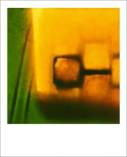
This is from a series of photos taken by Xavier Damon. This photo really caught my eye when going through his whole series. The subtle fade of the saturated yellow into saturated green makes the transition a lot less dramatic and is easy on the eye. The strong contrast of light to dark also adds to this photo, your eye is immediately drawn to the dark square just below center. If this were not in color I don't think it would be as good of a composition, if it were in B&W it wouldn't keep the intensity the color achieves.


Jan Staller -- Steel Girders New York 2001
http://www.janstaller.net/photo/earlier-images/
This photo just says "pop" to me. The red girders couldn't be emphasized more in this photo. Repetition of lines is a strong factor in this. What I like the most about this composition would have to be all of the shapes and angles created by the girders. Each shape is unique within the confines of the edges of this picture. The subtle smears of red on the walls; possibly chalk or worn down paint brings your eye to the background and adds to the overall mood.