Friday, April 20, 2012

A Bundle of Blogs

Jacob Sutton
http://www.thisiscolossal.com/2012/04/underwater-portraits-by-hana-al-sayed/
Jacob Sutton has a wonderful idea here. taking pictures of a woman within foggy water. This photo has a dream-like quality to it. The way that her head is in focus and behind her cheek is out of focus is amazing. Not because of the aperture but because of the foggy water. Overall great idea and well composed photograph.

Rosie Hardy
http://www.flickr.com/photos/rosie_hardy/5594438139/in/photostream
I think this is a very powerful image with a great depth of field and color palette. The way Hardy incorporates the color of the figures shirt in to the environment is flawless. Yet she separates the shirt from the yellowed decaying branches. While still keeping a very engaging photograph.

Florian Imgrund
http://www.thisiscolossal.com/2012/03/double-exposure-photographs-by-florian-imgrund/
To get an image such as this in analog takes alot. Takes a lot of luck or a lot of skill or a lot of both. Either way this is a great image. The horizon line meets up perfectly with the sunglasses on the figure, the sky is exposed just enough within the head of the figurer and yet we still get enough information to make out distinguishing features on the face of the figure. Great capture.

Mierswa Kluska
http://www.mierswa-kluska.de/portfolios/special-effects
This is a great concept. Something the average person may never see is the inside of an instrument. especially the inside of a violin/cello or whatever it may be. The lighting in this photograph is also very amazing, creating a very great mood for the image. The inside of this instrument also has a very monumental feeling to it. Most likely due to the wide angle lense that Kluska used.

Mierswa Kluska
http://www.mierswa-kluska.de/portfolios/special-effects
I realize this is a photoshopped image but, it is photoshopped very well. And with a great idea behind it. The bottle has a flame coming out of it the same way a flame would expel from a blow torch. Does this mean alcohol is fire? Burning our very existence? I really don't know but either way the image is great.

Alberto Seveso
 http://www.behance.net/gallery/a-due-Colori/3367841
Alberto Seveso has several ink in water images in his recent series a due Colori but this one I was particularly drawn to. I do believe it is because of the layering and overlapping that is apparent in this image. The way that the blue ink overlaps the red ink in the lower right hand image is fascinating to me. The way that ink can separate in water is beautiful. He also has very very sharp images and i can image that is very hard when these images are taken in water.

Mario Zenaria
http://www.flickr.com/photos/zamario/6275756985/in/set-72157626385993282/
I appreciate this a lot. One, its done in film. Two, it takes a bit more thought than your normal snap and shoot. Yes, it does resemble David Hockney's grids but in a different aspect. There is less room for post manipulation. Correction, there is NO room for post manipulation. (That is if Zenaria is true to the film and does not edit the images in photoshop post) Overall this image is very well composed and though out. Zenaria has to first get the exposure absolutely perfect and then run with it. Making sure every picture is in focus and not blurred (unintentionally) could be very very meticulous. But I like that in photography.

Laura Zelenga
http://www.flickr.com/photos/laurazalenga/5433839648
I have found myself putting up more and more portraiture throughout this blog. Partly due to the fact that this week we have a portrait assignment. Partly because I really need to up my game in portraiture. I say this because I do not have the most experience dealing with portraiture and people. At any rate this is a very intriguing image. Slightly off centered. Making me ask questions like is that a mirror or a whole in a table? who took the picture? In my aesthetic this image could not be better due to the fact that it is making me ask so many questions. It makes it even better that this image is so minimal.

Luca Pierro
http://www.flickr.com/photos/sottounponte/5794565338/in/photostream/
How cool is this? The texture created in this image the shadows that the texture produces and the subtle tones are just amazing. Absolutely amazing. What a great combination of constructive photography and portraiture. The shaving cream we will use in a lifetime. The being we are transformed into after we shave. Those piercing eyes are also very very powerful. GREAT image.

Magdalena Szurzek
http://www.flickr.com/photos/sottounponte/sets/72157624629105353/?page=2
This is an impressive photograph. On the site I believe it said the camera was set to 1/2000s @ f18 ISO 100. But it appears to be very similar to a night photograph. Props to the photographer who captured this. The orange and white sign creates ones eye to start there and then move on to the building behind it. Then back around from the sky to the texture of the snow on the left hand side of the image. Well composed and excellent movement in the photograph.

Kim Høltermand
This photograph is very well done and resembles the book i just finished recently. What helps in this photograph would be the thing itself. As well as the strictly photographic qualities. Such as the glow surrounding the building and the high energy that the lights are emitting. The symmetry in this image also benefits the monumental feeling that the building embodies.

Robin Cerutti
http://www.behance.net/gallery/INSIDE-ESCAPE-_-nyc/3477149
This is an interesting concept for city scape photographs. A new spin that i think works very well. I find it interesting that the reflection shows a greater depth of field and gathers a different angle of the city. The distance that is created is amazing and keeps my eye wanting to see farther and farther.

Peter Lundtsrom
http://www.behance.net/gallery/Circus-Depression/2966019
This is a very dark photograph. I know quiete a few people who would be very disturbed by this image. Although it may be a disturbing image it is very well composed the run down building has great detail and texture. This allows the eye to bounce around before moving to the floating clown at the top right of the image. The lighting on the clown matches the lighting on the building but the sky in the background does not come across as believable to me.

Hekki Leis
http://www.behance.net/gallery/PORTRAIT-OF-WOMEN/3336701
This photo by Hekki Leis resembles meatyard strongly. In the manner of mystery due to the covering of the figures face. But Leis takes it in another direction with the braiding of the figures face to create a mask. At first one may associate the hair with a shroud covering but after further examination the hair becomes apparent. The texture created from the wood slot building compliments the flat tones of the clothing that the figures are wearing. 

Mate Moro
http://www.behance.net/gallery/LAST-BREATH/3304968
Mate Moro has an excellent sense of lighting in this photograph. This image is very crisp and has a great cool tone adding a darker mood to the image. My eye is constantly moving around the composition grabbing on to information and moving on to more. Well organized and use of negative space within the frame.

Akos Major
http://www.behance.net/gallery/Lumen/3124477
This is a very interesting photograph due to the immediate recognition of the shipping crates in the foreground. One may associate the Containers as a stack of books at first glance or a which adds an interesting quirk to this image. One may then recognize the industrial structures in the flattened telephoto image. A great use of the "smashing" effect a telephoto lens can create.

Benoit Paille
http://www.behance.net/gallery/Light-experimentation/3596405
I appreciate this image due to the thought put into this image. Paille mentions in his artist statement for the work that he is unsure of pushing this series. For experimentation the images are of great nature. To make assumptions i would imagine Paille took a long exposure around 30s while leaving the headlights on in his car, either for the full 30s or a bit shorter to make sure the trees are not overexposed. i may also suggest that there is another car beyond the left side of the frame.

Fabrice Fouillet
http://www.behance.net/gallery/Damaged-Cosmetic-for-WAD-n52/3449249
This is a very interesting image. I appreciate the fact that this is not only a photograph but a kinetic sculpture as well. The craftsmanship is spot on as well as the inventiveness of the contraption. Combining two mediums can be tricky but the execution reveals this to be a very successful combination.

Ze Diego + Diamantino Jesus
http://www.behance.net/ddiarte
This image is very interesting. The use of a plastic sheet is a great idea. The sheet allows the viewer to gather pretty de script details while also masking other attributes of the figures in the fetal position. The two genders are one. Encased in this sheet that hints towards the membrane that all humans spend, on average, nine months in. The sheet also creates interesting highlights and shadows to further emphasize the two figures.


Thursday, March 22, 2012

Suren Manvelyan
http://www.behance.net/gallery/Your-beautiful-eyes/428809
I think this photo is absolutely astonishing. Partly due to the fact that I had no idea that the human eye was quite like that. The way the photographer captured the texture on the pupil is amazing. This leather -like texture that almost resembles water. the patterns within the iris is so random yet organized at the same time. Our bodies in general are awesome to begin with and these photo's let people such as myself enjoy the thought of how we are designed incredibly.

Mikko Lagerstedt
http://www.behance.net/gallery/a-t-m-o-s-p-h-e-r-e/2847831
This picture makes me want to drop everything and buy a ticket to go to Finland. Beautifully exposed and captured. The detail in the sky as well as the rocks and even under the water is superb. This is my kind of photography, pushing the limits of the camera. Another reason I enjoy this photograph is the fact that this may be what one would actually see while being in Finland. What i mean by that is you would see the stars this crisp as well as the rocks on a night like this.

Jason Armstrong
http://www.behance.net/gallery/Photography/3034669
For animal photography this is a phenomenal photograph. Using depth of field to the photographers advantage as well as lighting. The clarity of the gorilla's face and body is very intriguing as well. it almost appears to be an HDR photograph but I'm not sure how the photographer would get three to five shots off that fast while the gorilla was eating. Even though the photograph is centered it does not bothe me. The lighting seems to be what makes the photograph for me, getting every detail in the gorillas face, body, etc. 

Friday, February 24, 2012

Chrissie White
http://blacren.com/2009/03/flickr-find-chrissie-white-photography/
This image is very intriguing to me. It creates a lot of unanswered questions. I want to know wethere this is digitally edited of a snap shot of a girl jumping over the bed and catching it just at the right time. The lighting seems to be acceptable by my eyes standard which is why I am split between a straight shot or photoshop. None the less it is very well executed with an interesting cool and muted color palette while still capturing an interesting photograph. I am now sort of interested in catching uncommon situations or surrealistic images after seeing this. It is making me think and i appreciate that in an image.

Chrissie White
http://chrissiewhite.blogspot.com/
I chose this image for several reasons. One of the main reasons is the recent occurrence of nice weather in this fine state of Delaware. The weather reminds of the beginning of spring, where there are still leaves on the ground and yet the trees and environment is starting to bloom. There is a great sense of atmosphere in this photograph as well. The way the light is seen in a beam coming through the trees and softly landing on the ground to create these highlighted emphasized shapes on the forrest floor. With out the clouds of fog in this image it would not be as successful, it would not be as interesting. It would be more mundane and less surreal/dreamy.

Edax Omni
http://www.flickr.com/photos/edax/85027932/lightbox/
I think this is just a beauitful image that is compositionally sound. Another reason I appreciate it is Omni's sense of lighting, the skin on the figure is so soft and smooth it almost resembles a statue. Omni also creates a sense of mystery by not showing the eyes of the subject,  now it is also very possible that isn't real and its a mannequin. just because of hoe the lips seem so close to skin tone and that that skin tone is almost to fair to be human. But either way this is a great photograph with great framing especially with a close-up such as this. The rim light on the hoodie also seals the deal to complete the swooping line created across the image due to the negative space. 

Bill Owens
http://www.flickr.com/photos/wrong/92401003/
This image is a lot different than most in this series. The series being Suburbia. I say this because there are no figures in this image. And it feels a lot less home"y" than the other images because of the lack of materials and the open space. Now that is not to say that someone couldn't consider this their home but it does lack a sense of love and completion that most homes. 

Bill Owens
file://localhost/Users/McLaughlinC/Desktop/image-by-bill-owens.jpeg
"We're really happy. Our kids are
healthy, we eat good food, and we
have a really nice home."
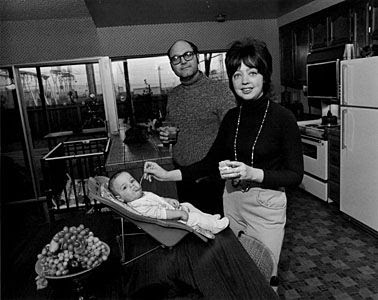
Owens incorporates quotes from his models. By doing so he creates a sort of time stamp, much like the cars in Stephen Shore's photographs. What may seem to the norm at the time can now have an almost comedic quality. Solely for the fact that it is a new era with new beliefs. This is a very interesting photograph especially with the quote added in his series Suburbia his sense of organizing shapes within the frame is well thought out and executed. The confrontation of the two adults and even the baby seals the deal to this "perfect" family portrayed by owens and his camera.


Bill Owens
file://localhost/Users/McLaughlinC/Desktop/image-by-bill-owens.jpeg
We really enjoy getting together with
our friends to drink and dance. It's a wild
party and we're having a great time.
Another picture by Owens' series Suburbia with another odd quote. It almost seems as if the quote is from a T.V. series of the "perfect couple" in your average America. It almost seems fake, or as a front by these people. Or maybe they are jus naive? They aren't putting on a front for the camera, maybe it is just the juxtaposition of the quote of a wild party and this portrait of a couple portraying a sense of calm. far from wild. Yes, the juxtaposition is what gives this series a curve from the norm. I think it works, very well actually, and proves the point on how titles or captions included with photograph's can make them more interesting.

Friday, February 10, 2012

Week 4

Len Jenshel
http://holykaw.alltop.com/allphotopic-mount-st-helens-30-years-later
This photograph is very monumental. A different perspective on a landscape with a lot of texture. This image almost seems black and white. The drift wood leads your eye to the horizon line as well as back to the mountains. Another reason I like this image is because it was shot for national geographic.  There is also a great depth in this image and use of dark tones.

Len Jenshel
http://gallery.pictopia.com/natgeo/photo/9448953/
This is a very amazing photograph. The way that Jenshel captured the fireworks as well as evening out the light on the fence. I also think this is a great example of mixed light as well.  The compliments of red and green as well as the tungsten light on the fence. The fence also creates a line for your eye to travel stopping at the couple gazing in the distance and then looking up towards the fireworks.

William Eggleston
http://artblart.wordpress.com/2010/05/18/exhibition-william-eggleston-democratic-camera-photographs-and-video-1961-2008-at-the-art-institute-of-chicago/
I think this is a great use of fluorescent lighting. The composition is spot on as well. The way that Eggleston arranged the objects within the frame. This photograph has a very cold. "prim" if you will environment. The subtle creases in the chair that relate to the creases in the bed.

Thursday, February 2, 2012

Stephen Shore Week 2

Stephen Shore
http://champagneandheels.com/art/stephen-shore-in-aspen/
I believe this is a very successful photograph that also screams SHORE! I say this because he has a very distinct range of tones and hues, possibly due to the film but at any rate very distinct. Something i find very intriguing is the fact that there are very minimal objects in this picture and yet it is composed to its full potential. It is a very good example of how you do not need a very cluttered frame to produce something interesting. I also appreciate the relationship of the gap between the truck and the white pole, as well as the two poles to the sign.

Stephen Shore
http://jmcolberg.com/weblog/extended/archives/a_conversation_with_stephen_shore/
This is one of my favorite Shore photographs. Reason being, it has a great sense of a hotel or guest room. I would assume hotel just because of the mount for the T.V. and the glass over the desk. It is amazing to me that Shore has captured such a photograph with the tonal range of the room being spot on and the window blown out just enough. You cannot see outside and it is just barely extruding onto the trim of the window. The addition of the feet with the shoes on the bed also relates to the idea of a hotel; someone there but ready to leave at any moment, with the suitcase unlatched but not open. 

Stephen Shore
http://modernartobsession.blogs.com/modern_art_obsession/2005/12/stephen_shore_a.html 
This I would have to say does not seem like a very interesting image. Yes, the colors could be interesting in the sense that he utilizes the main colors on the color wheel but other than that it appears to me as a snap shot. Or in better words a documentation. It almost reminds me of a picture that a college student would take to show there fridge after they realized you're not supposed to unplug it and keep the doors closed over winter-break. So maybe it is more the idea behind the photograph than the actual photograph that bothers me. Although it still does not show the essence I can see in most other photographs that Shore has produced. 

Friday, January 20, 2012

Week 1 Color Photo

Richard Misrach
http://artjetset.com/2010/01/15/richard-misrach-at-pacewildenstein-2/
I was intrigued by this image due to the fact that I have never seen something like it before. When I first saw it seemed as if there were huge salt deposits in the dessert crystallizing to from these structures. But as  I read into it it is actually Misrach's style of using a digital negative or at least parts to create such an image. It made me ask several questions as well as jogged my mind which makes this photograph very successful in my opinion.

Tim Davis
http://nicolettalollibestphotographers.wordpress.com/2010/06/17/©-tim-davis/
I thought this photograph was quite interesting and it also fit in with the assignment this week. The very neutral hues surrounding this pinnacle of color. Another thing that adds to this photograph is the warped form of a very recognizable subject matter; McDonalds. Davis may have a deeper meaning behind this photo as well, our societies engrossing taste for this fast food and the effects it has on ourselves as well as our community. This overly projected business that is contained by a decaying or not as well maintained house. The composition is also very strong letting the eye immediately go to the color and shift around the subtle hues around it.

Len Jenshel
http://photography.nationalgeographic.com/photography/enlarge/staircase-escalante-building_pod_image.html
This photograph is also very amazing. It makes me want to be there, to touch the building and experience all this environment has to offer. Maybe its because 1. I love National Geographic or 2. I love the outdoors and can't wait to travel. But at any rate the way that Jenshel makes the building pop from a very similar hue'd background is excellent. He also has a a great contrast of blacks as well as white tones. The color in this the texture is also very intriguing to me, and its very surprising that it wasn't picked for the assignment he shot for.